In this tutorial, we discuss about How to create a Histogram in Excel. A histogram is a common data analysis tool in the business world. It’s a column chart that shows the frequency of the occurrence of a variable in the specified range.
According to Investopedia, a Histogram is a graphical representation, similar to a bar chart in structure, that organizes a group of data points into user-specified ranges. The histogram condenses a data series into an easily interpreted visual by taking many data points and grouping them into logical ranges or bins.
A simple example of a histogram is the distribution of marks scored in a subject. You can easily create a histogram and see how many students scored less than 35, how many were between 35-50, how many between 50-60 and so on.
There are different ways you can create a histogram in Excel:
- If you’re using Excel 2016, there is an in-built histogram chart option that you can use.
- If you’re using Excel 2013, 2010 or prior versions (and even in Excel 2016), you can create a histogram using Data Analysis Toolpack or by using the FREQUENCY function (covered later in this tutorial)
Table of Contents
Let’s see how to create a Histogram in Excel.
Create a Histogram in Excel 2016 and newer versions
Create a Histogram Chart
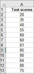
Step 01: Select your data.
(This is a typical example of data for a histogram.)
Step 02: Click Insert > Insert Statistic Chart > Histogram.
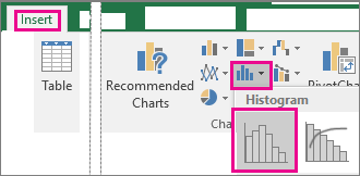
You can also create a histogram from the All Charts tab in Recommended Charts.
Tips:
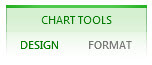
1. Use the Design and Format tabs to customize the look of your chart.
2. If you don't see these tabs, click anywhere in the histogram to add the Chart Tools to the ribbon.
Configure Histogram Bins
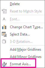
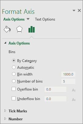
Right-click the horizontal axis of the chart, click Format Axis, and then click Axis Options.
Use the information in the following table to decide which options you want to set in the Format Axis task pane.
Options with Description
By Category: Choose this option when the categories (horizontal axis) are text-based instead of numerical. The histogram will group the same categories and sum the values in the value axis.
Tip: To count the number of appearances for text strings, add a column and fill it with the value “1”, then plot the histogram and set the bins to By Category.
Automatic: This is the default setting for histograms. The bin width is calculated using Scott’s normal reference rule.
Bin width: Enter a positive decimal number for the number of data points in each range.
Number of bins: Enter the number of bins for the histogram (including the overflow and underflow bins).
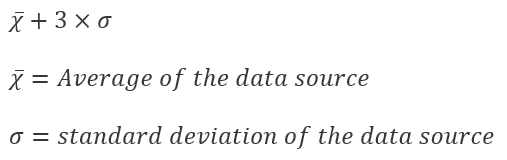
Overflow bin: Select this check box to create a bin for all values above the value in the box to the right. To change the value, enter a different decimal number in the box.
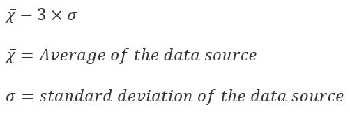
Underflow bin: Select this check box to create a bin for all values below or equal to the value in the box to the right. To change the value, enter a different decimal number in the box.
Formulas used to create Histogram
Automatic option (Scott’s normal reference rule)
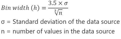
Scott’s normal reference rule tries to minimize the bias in variance of the histogram compared with the data set, while assuming normally distributed data.
Overflow bin option
Underflow bin option
About Histogram Data
To create a histogram in Excel, you provide two types of data — the data that you want to analyze, and the bin numbers that represent the intervals by which you want to measure the frequency. You must organize the data in two columns on the worksheet. These columns must contain the following data:
- Input data This is the data that you want to analyze by using the Histogram tool.
- Bin numbers These numbers represent the intervals that you want the Histogram tool to use for measuring the input data in the data analysis.
When you use the Histogram tool, Excel counts the number of data points in each data bin. A data point is included in a particular bin if the number is greater than the lowest bound and equal to or less than the greatest bound for the data bin. If you omit the bin range, Excel creates a set of evenly distributed bins between the minimum and maximum values of the input data.
The output of the histogram analysis is displayed on a new worksheet (or in a new workbook) and shows a histogram table and a column chart that reflects the data in the histogram table.
Create a Histogram in Excel 2007 – 2013
- Make sure you have loaded the Analysis ToolPak.
- On a worksheet, type the input data in one column, adding a label in the first cell if you want.Be sure to use quantitative numeric data, like item amounts or test scores. The Histogram tool won’t work with qualitative numeric data, like identification numbers entered as text.
- In the next column, type the bin numbers in ascending order, adding a label in the first cell if you want.It’s a good idea to use your own bin numbers because they may be more useful for your analysis. If you don’t enter any bin numbers, the Histogram tool will create evenly distributed bin intervals by using the minimum and maximum values in the input range as start and end points.
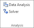
- Click Data > Data Analysis.
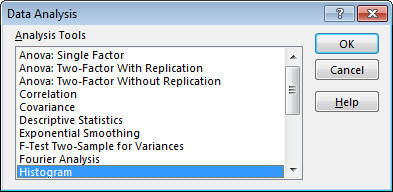
- Click Histogram > OK.
- Under Input, do the following:
- In the Input Range box, enter the cell reference for the data range that has the input numbers.
- In the Bin Range box, enter the cell reference for the range that has the bin numbers.If you used column labels on the worksheet, you can include them in the cell references.Tip: Instead of entering references manually, you can click
 to temporarily collapse the dialog box to select the ranges on the worksheet. Clicking the button again expands the dialog box.
- If you included column labels in the cell references, check the Labels box.
- Under Output options, choose an output location.You can put the histogram on the same worksheet, a new worksheet in the current workbook, or in a new workbook.
- Check one or more of the following boxes:Pareto (sorted histogram) This shows the data in descending order of frequency.Cumulative Percentage This shows cumulative percentages and adds a cumulative percentage line to the histogram chart.Chart Output This shows an embedded histogram chart.
- Click OK.If you want to customize your histogram, you can change text labels, and click anywhere in the histogram chart to use the Chart Elements, Chart Styles, and Chart Filter buttons on the right of the chart.
 to temporarily collapse the dialog box to select the ranges on the worksheet. Clicking the button again expands the dialog box.
Similar Topics
1. Create a Funnel Chart in Microsoft Excel
2. Create a PivotTable to analyze worksheet data
3. Create a Map Chart in Microsoft Excel 2019
4. Excel Table – How to Create and Manage in Microsoft Excel