You can use a Map Chart to compare values and show categories across geographical regions. Use it when you have geographical regions in your data, like countries/regions, states, counties or postal codes.
Before the start, do have a look on “What’s new in Excel 2019 for Windows“
Table of Contents
Display Values vs. Categories
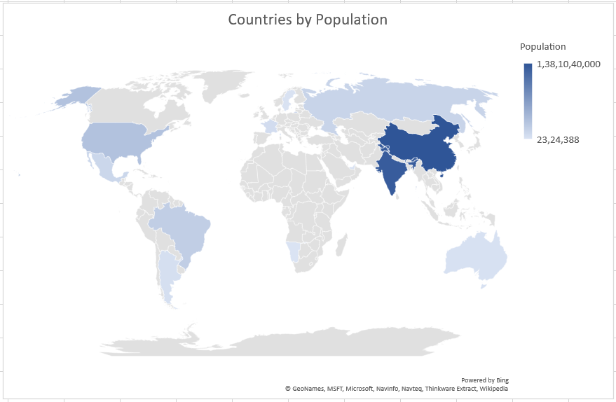
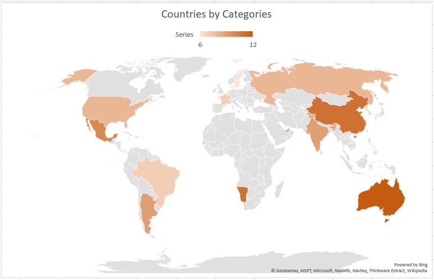
Maps can display both values and categories, and they each have different ways of displaying colour. Values are represented by slight variations of two to three colours. Categories are represented by different colours.
For example, Countries by Population uses values. The values represent the total population in each country, with each portrayed using a gradient spectrum of two colours. The colour for each region is dictated by where along the spectrum its value falls with respect to the others.
In the following example, Countries by Category, the categories are displayed using a standard legend to show groups or affiliations.
Create a Map chart
Step 1: Create a Table
Create a table or you can copy the following data that we used for our examples, or set up your own in a similar fashion. Start with one column for your geographic location (country/region, state or province, county or postal code), then your numeric or categorical values in the second column.
| Country | Series | Population |
| China | 11 | 1,38,10,40,000 |
| India | 9 | 1,31,07,60,000 |
| United States | 8 | 32,43,94,000 |
| Brazil | 7 | 20,69,82,000 |
| Russia | 8 | 14,67,27,405 |
| Mexico | 10 | 12,22,73,000 |
| France | 7 | 6,69,91,000 |
| Argentina | 9 | 4,38,50,000 |
| Australia | 12 | 2,43,33,500 |
| Sweden | 6 | 99,98,740 |
| United Arab Emirates | 9 | 98,56,000 |
| Namibia | 11 | 23,24,388 |
Step 2: Select Cell
Select any cell within the data range.
Step 3: Select Map Chart
Click Insert > Charts > Recommended Charts, or Insert > Charts > Maps, then select the map chart.
Depending on your data, Excel will preview either a value or category map.
Step 4: Insert Map
Once you press OK, Excel will insert your map.
Formatting your Map chart
Once your map has been created you can easily adjust its design. Just click on the Map, then choose from the Design or Format tabs in the Chart Tools ribbon tab. You can also Right-Click on the chart and select from the menu options there, or double-click the chart to launch the Format Object Task Pane, which will appear on the right-hand side of the Excel window. This will also expose the Map chart specific Series options.
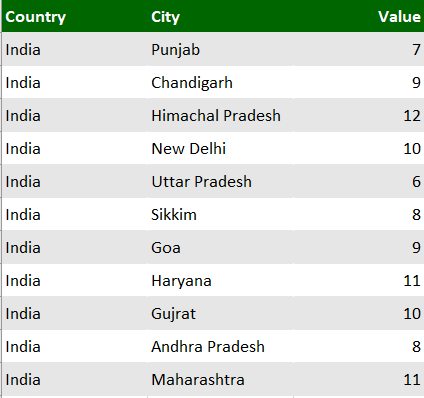
Please note that, If you use data where there might be more than one similar location in the world, Maps can’t necessarily tell the difference without more guidance. If possible, add another column to your data to help Maps know where to look. For example, this data won’t necessarily map the way you expect since there are many places in the world where these are valid county names.
Here is an Example for Map Chart that needs High-Level Geographical Data Detail
Let us suppose we have the following information or data
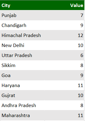
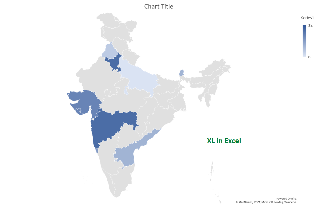
Here is the result of the data mentioned above. It clearly indicates that map charts need High-Level Geographical Details.
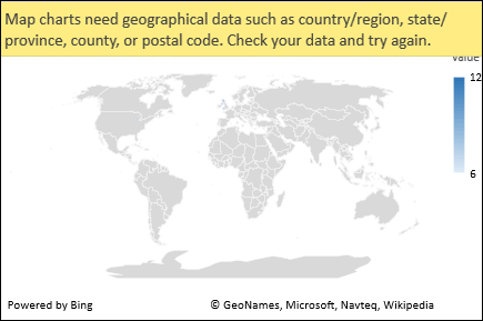
But the data should map correctly if you add another column for higher-level detail – This is called Disambiguation
Here is the map chart for the above Data or Information
Limitations of Map Chart
- Map charts can only plot high-level geographic details, so cities, latitude and longitudes, and street address mapping isn’t supported.
- Map charts support one-dimensional display only.
- Creating new maps, or appending data to existing maps requires an online connection (to connect to the Bing Map service).
- Existing maps can be viewed without an online connection.
- There is a known issue where Map Charts which make use of Geography Data Types can sometimes map incorrectly. Please try to include Admin Fields, such as Country when attempting to plot these until the problem is fixed.
Click here to Download the Excel file of the Example
If you have any doubt, feel free to contact.